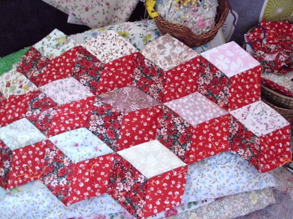
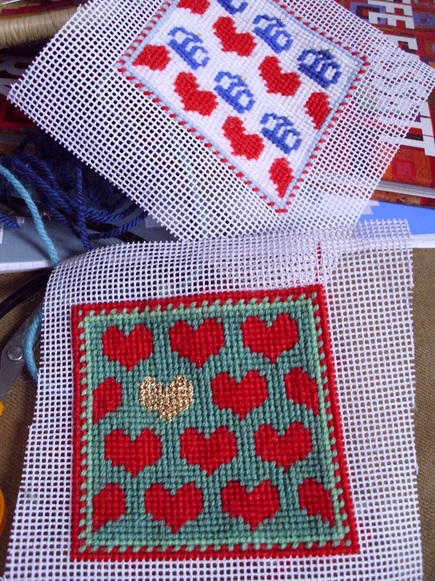
Tumbling blocks is an extremely old patchwork pattern. It can be machine-made, but this one's assembled using the English paper piecing method. It's a slow & steady way to create, but has the advantage of being very portable. You can take your sewing with you on sunny days in the park or when you travel. The 3D effect works well as long as you have a darker diamond, a mid coloured one and a lighter shade. I'm using two mainly red fabrics plus a variety of lighter ones, but the pattern would work with a complete mix of scraps, as long as the dark/medium/light balance is kept.
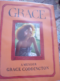
On the reading front, I've started 'Grace' which I stumbled across by chance in the library. (As always, thank heavens for libraries. They're a blessing, aren't they?) If you've not heard of her, Grace Coddington is a creative director at American Vogue. I only really knew about her, like many people, through the film 'The September Issue'. She was the inadvertent star of it, much more engaging than the chilly Anna Wintour, and clearly passionate about clothes. I'm not a fan of Wintour (she wears and through the magazine American Vogue promotes the wearing of real fur. Vile.) and don't buy fashion magazines. Too advert-heavy, too interested in fashion brands rather than beautiful clothing. However, it's fascinating to read about this entirely different world, and how a girl from a remote island off North Wales became immersed in it. I used to buy fashion mags as a teenager in a dull as ditchwater English market town. During boring factory jobs, dreaming of escaping, I read Vogue and Elle, seeing glimpses of another life, one of glamorous locations and fabulous photoshoots. It's a shame that fashion mags nowadays are just vehicles to push brands. Clothes, perfume, make up. It's all about who made it and what it cost. Clothing has been reduced to brands, when it should be about flair, creativity, individuality, telling stories of who we are, who we want to be, the tales of our lives, not just which shop we went into or how much cash we have.
The St. Jude storm's been and gone, and didn't affect me apart from minor inconveniences. (Lack of TV reception, being kept indoors for much of yesterday due to monsoon like rain.) However, reports of people killed by falling trees and a teenage boy having drowned put any little grumbles in perspective. At least being cooped up indoors forces me to get stuff done!
I've sewn the backing on to a couple more draught excluders and am stuffing 'em with filler. A rolling pin comes in very handy for that. You can't use anything sharp to force the filler down to the far corners. Something like a knitting needle would pierce either canvas or backing fabric, but a rounded edged wooden rolling pin is ideal. I've also completed a couple more swatches following on from my experiments with heart motifs (see previous posts). In the last of 'em the heart disappears entirely so the pattern's totally abstract. In between this I've dug out a piece of patchwork I started ages ago and am - very slowly - adding a few more tumbling blocks to it. The 3D effect you get is so effective, and I'm pleased with the choice of reds for the fabric. Makes for a warm and cosy look. More on that another time though.
Swatches showing a pattern in development.
Hey! They don't do this with their rolling pins on the Great British Bake Off.
No, it's not a pirate themed post, despite the 'har har me hearties!' title. Sometimes a girl just feels like breaking out into pirate-speak. ;-) I'm still harking on the same theme of hearts. Making these little swatches is a great exercise. You can do something similar playing with coloured pencils and graph paper, but it's not the same as seeing the stitches. As you keep going, you get ideas about developing the pattern, as shown here. Adding a checkerboard background to the multi coloured hearts makes 'em stand out. Doing that led to more hearts, but these ones squashed up together. You're made aware of the space between the motifs - in this case, small squares. Should they be cream to make them merge into the background? Or a bright colour to draw attention to their shape?
As I type this, it's pouring with rain outside. I'm venturing out for my painting class this afternoon, so fingers crossed it clears up. Oh well, it's filling the reservoirs and gives me a great excuse for not tending my allotment!
I'm enjoying this theme of hearts, playing around with colour on small swatches of canvas . This time I put the hearts in lines of 4 and against a wide-striped background. Initially I stitched the tomato red hearts and added two grey stripes. Grey's not a colour I use - or wear - a lot. Maybe it reminds me too much of dreary school uniforms or rainy cold skies. It's not a chic colour like black, or an uplifting colour like a zingy citrus shade, for eg. But grey can be good for backgrounds as it can make a motif stand out. With the red and grey in place it took ages to work out what other colours to use. The mustardy yellow and chocolately brown were chosen by trial & error as well as being limited by what wool I've got. But they were good choices as they warmed up the grey, and I think the end result looks rather pleasing. That swatch led on to another, not yet completed. (See photo below) I'm considering adding a black & white/cream checkerboard background to the multi coloured hearts. Oui or non?
I used the hearts from yesterday's needlepoint pattern to create another repeat design. Using the gold metallic thread definitely gives it some extra zing. I reckon the combo of tomato red and green goes well together, though I'd have preferred a lighter minty green. (It was another case of working with the colours I'd got, rather than buying new wool.) I might try the hearts on a striped background next. Though I really shouldn't be diverting myself from completing projects already in progress. Honestly! I really am the mistress of procrastination. Anyone else having the same problem?
Loitering in the library the other day I came across a book of Fair Isle designs. While it's designed for knitters, the Fair Isle patterns translate beautifully into needlepoint. Finding this little crown pattern I had an idea about creating a red, white 'n' blue pincushion. Using the wool I had rather than buying new I limited myself to white, red, a pale and a darker blue, plus a gold metallic thread. Useful notes : white is a deadening colour. Often cream or off-white works better than brilliant white which can be too harsh. The gold metallic worked better than silver, which just disappeared into the background. The crown pattern works well viewed close-up, but doesn't translate quite so well from a distance. I might have another go at the design, and tweak it a bit. (The Fair Isle book, by the way, is '200 Fair Isle Designs' by Mary Jane Mucklestone. Published by Search press. A lovely publication.)
And finally ... don't these luscious colours make you want to pick up a needle?
Sunday afternoon was partly spent at the Windmill Hill art trail. I splurged on a couple of ceramic pieces. They were too lovely to pass up, and great value at a tenner each. It's always good to buy handmade, especially direct from the maker rather than a conventional high street shop. I particularly like the blue swirls on the teacup and saucer, and its generous size. Having done a ceramics course (I was a bit hopeless at it ...) I really appreciate the work that's gone into making them.
The needlepoint on the right's being stretched back into its original shape, and the half-worked piece on the left is just there for me to contemplate. I've ran out of the brown tapestry wool for the hare, so need to buy more. Foolishly I started filling in some areas with other shades of brown either too light or too dark. I want a dappled kind of effect with the hare's hair, but you have to get the dappling effect right. Your eye should see the main colour and little pinpricks of other similarly toned colours, not be distracted by too dark/too light patches. Difficult to explain without showing photos close up (a blog entry for another day perhaps), Anyhow, I might need to unpick some areas. Annoying but sometimes necessary. It would be even more annoying if I finished the needlepoint but always felt a nagging 'that bit's not right' every time I looked at it.
Because I've not got the right canvas to start my fox design yet - and because I'm flaming well incapable of actually starting a project and finishing it before beginning the next one (sheesh!! So many half finished quilts and cushions ... ) I began a small piece of needlepoint which'll probably be a modestly sized wall hanging. (Not sure if, once completed, I'll frame it or just back it with fabric.) It was inspired, if that's not too arty a word, by a book illustration I'd seen in a magazine. (Top left of page) I did a very rough sketch, and then just winged it - using what limited colours I've got in my wool basket and hoping it'll turn out how I want it. I'm using metallic gold thread to give the sky some shimmer, and am even getting ahead of myself - thinking of a different version. A night sky of dark blue with silver instead of gold. Then the two versions could hang side by side, a summery day and a moonlit night. Yup, that's me all over. Always thinking ahead!
Hi - I'm a (mumble mumble) year old singleton, living in South West England, in a cluttered flat with too many metres of fabric and too few biscuits in the tin!