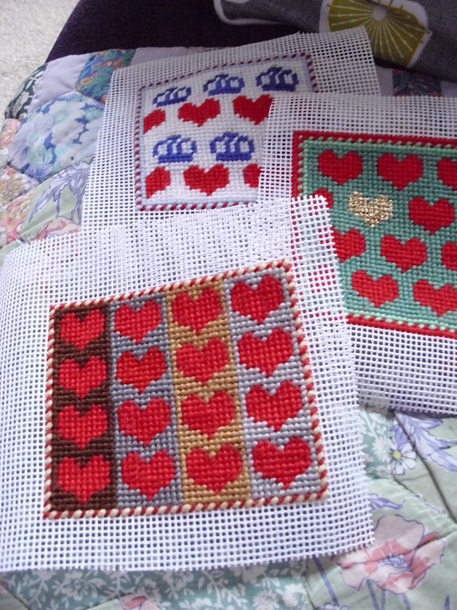
I'm enjoying this theme of hearts, playing around with colour on small swatches of canvas . This time I put the hearts in lines of 4 and against a wide-striped background. Initially I stitched the tomato red hearts and added two grey stripes.
Grey's not a colour I use - or wear - a lot. Maybe it reminds me too much of dreary school uniforms or rainy cold skies. It's not a chic colour like black, or an uplifting colour like a zingy citrus shade, for eg. But grey can be good for backgrounds as it can make a motif stand out.
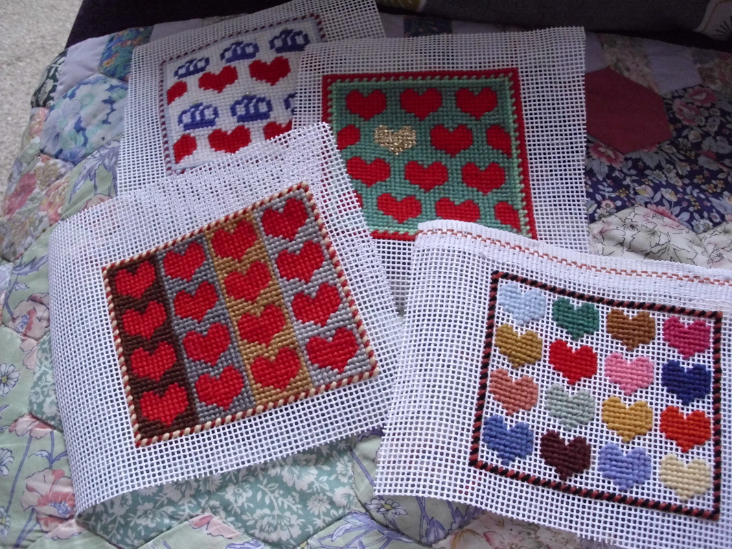
With the red and grey in place it took ages to work out what other colours to use. The mustardy yellow and chocolately brown were chosen by trial & error as well as being limited by what wool I've got. But they were good choices as they warmed up the grey, and I think the end result looks rather pleasing. That swatch led on to another, not yet completed. (See photo below) I'm considering adding a black & white/cream checkerboard background to the multi coloured hearts. Oui or non?
Grey's not a colour I use - or wear - a lot. Maybe it reminds me too much of dreary school uniforms or rainy cold skies. It's not a chic colour like black, or an uplifting colour like a zingy citrus shade, for eg. But grey can be good for backgrounds as it can make a motif stand out.
With the red and grey in place it took ages to work out what other colours to use. The mustardy yellow and chocolately brown were chosen by trial & error as well as being limited by what wool I've got. But they were good choices as they warmed up the grey, and I think the end result looks rather pleasing. That swatch led on to another, not yet completed. (See photo below) I'm considering adding a black & white/cream checkerboard background to the multi coloured hearts. Oui or non?
 RSS Feed